REVIEWER
Enhancing restaurant review management software through interactive performance metrics
.png)
PROBLEM
Restaurants lack an effective tool for consolidating and
interpreting reviews
Research highlights the critical importance of reviews in shaping a restaurant's reputation and overall business success. During my time as a server, I identified the need to address the time-consuming and inefficient process of analyzing and compiling review insights. In response, I designed "Reviewer," a review management software that introduces interactive performance metric modules for swift identification of business performance and effective communication with staff.
SOLUTION
Interactive metrics for quick and efficient action
This dashboard features an interactive overview section that provides managers with real-time customer satisfaction insights across multiple review platforms, enabling targeted actions. Additionally, it allows managers to delve deeper into individual reviews through a detailed review interface.
O1 OVERVIEW PAGE
Reduce visual clutter to empower analysis
-
Reduce visual clutter of all performance metrics for a cleaner, more intuitive interface.
-
Utilize interactive modules for quick, visually engaging presentations to staff.
-
Filter and focus on critical performance indicators to design targeted, effective strategies.
O2 REVIEWS TAB
Provide context into who, what, and why
-
Contextualize user sentiment by reading the exact reviews provided by customers
-
Search and filter reviews by sentiment, text, time and review platform.
-
Highlight staff members to understand individual performance across time.
SOLUTION
RESEARCH
Extensive time and effort is required to gain deeper insights across competitors
I began by analyzing top competitors in the review management space through user reviews and feature capabilities. I quickly discovered that users were frustrated by the time it took to sift through reviews and uncover insights. Despite having similar features, none of the platforms offered a quick and interactive way for users to engage with their data without having to put time and effort into building a custom dashboard.

In analyzing user reviews, I developed a user persona that best embodied my target audience's motivations, goals, and frustrations.
_edited.png)
SOLUTION
After compiling all the key insights from the competitive analysis and user reviews, I was able to better understand the underlying issues users had. My analysis led me to 2 key pain points that needed to be addressed.
Difficulty compiling and analyzing reviews across platforms
Business owners and managers struggle to identify key trends in customer sentiment due to fragmented data across platforms and information overload, leading to missed insights and delayed action.
Insights buried in complexity
Business owners and managers find it challenging to extract meaningful insights from complex review platforms. High-level dashboards are often vague and lack interactivity, forcing users to create custom views just to access the information they need.
DESIGN PROCESS
Defining key metrics & prioritizing information hierarchy
Upon identifying the key pain points I went back to review the competitors in the space and analyzed which key metrics users deemed important. I employed affinity mapping to layout numerous metrics users mentioned, while also evaluating opportunities to combine or simplify similar metrics.
Hover to View Groupings
Overall Average
Rating
Satisfaction or Reputation Score
Benchmarking against industry/local average
Score change
overtime
Number & % of
reviews by rating
Total number
of reviews
Number of reviews mentioning staff
Review rating
per dish
Recent to YTD
reviews
Reviews over time
Review Sentiment
(Positive/Negative)
% of positive/negative reviews
Average rating by platform (i.e Google)
Number of reviews
on a given day
Review rating per location
Frequency of positive
& negative reviews
Read reviews by sentiment
Reviews by customer segment type
Number of reviews by sentiment
Keyword
identification
Review length
Repeat reviewers
Reviews by location
Review Overview
Reputation Score / Benchmarking
Review Tracking
Filter Capabilities
Sentient Outlook
Hard to Track / Unnecessary
First time reviewers
Net Promoter Score
Reviews leading to reservations
Like or thumbs up
on reviews
Customer effort score (ease of use)
Review response
rates
Average response
times
Once I uncovered what type of metrics users would come to expect on an overview section I surveyed 8 participants to gain a better understanding on the importance of each metric to ensure strong information hierarchy.

Card Sort
Assume the role of a restaurant manager assessing business performance via customer reviews. Rank the following metrics by importance. Rank 4 - Least important to Rank 1 - Most important
SOLUTION
With a clear understanding of the information users valued most, I began iterating on design solutions. Through multiple rounds of exploration—including module layouts, data visualizations, and interactive prototypes—I refined the information hierarchy to prioritize clarity and usability. The final design streamlined the user experience, ultimately reducing the time it took to surface actionable insights.
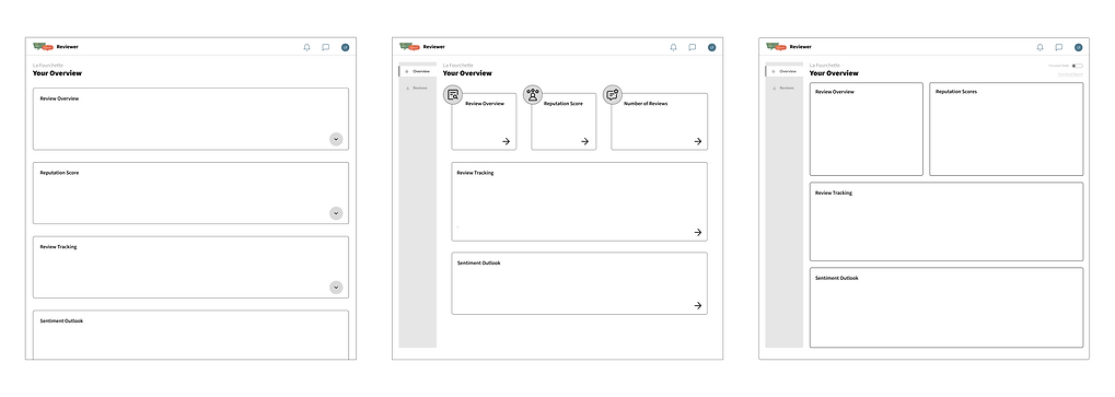
Overview Page Layout
I began by creating basic grid layouts to map the placement of individual modules and sketching out potential interactions. This allowed me to quickly define the overall structure of the interface before investing time in chart design and data visualization.
.png)
Interaction: Accordion style dropdown - expanding to dive deeper into metric
01. Large Accordion Modules w/ Dropdown Interaction
02. Small Key Metric Modules w/ Expandable Capability
Interaction: Ability to click to view deeper insights - expands module
Key Metrics
Scrollable
Interaction: Toggle on interactivity - allows for modules to be clickable and then opens a pop-up
Navigation panel - allows for a different menu for full list of reviews
Navigation panel - allows for a different menu for full list of reviews
Larger modules for most important metrics
03. Larger Key Metric Modules w/ Interactivity Toggle
Simple, linear structure. Easy for users to scroll through.
Clean separation of modules reduces visual clutter.
Inefficient for providing a quick overview of metrics due to excessive scrolling.
Lacks immediate visual prioritization as all modules look equal in size.
Prioritize key metrics at the top, supporting quick decision making
Expandable modules introduce progressive disclosure - users can dive deeper only when needed.
Dense layout—smaller card sizes may compromise readability and limit what can be displayed clearly.
Prioritize key metrics at the top, supporting quick decision making
Toggle for interactivity gives users control over engagement depth—ideal for both quick scans and deep dives.
Pop-up interaction keeps users in context, avoiding page reloads or disruptive navigation.
Interactivity toggle may not be immediately intuitive—requires subtle onboarding or UI cues.
I selected Option 3 because it directly addresses both core user pain points.
By allocating more space to key metric modules, this layout helps users quickly identify important trends without being overwhelmed by fragmented data, tackling the issue of compiling and analyzing reviews across platforms. Additionally, the interactivity toggle empowers users to explore deeper insights only when needed, reducing complexity and preventing information overload. This balance of clarity and control ensures that users can surface meaningful insights effortlessly, without the need to build custom dashboards.
Modules - Data Visulizations
When designing the modules and data visualizations, I focused on usability—ensuring key metrics were immediately scannable while still providing enough supporting data to uncover trends and invite deeper exploration, all without overwhelming the user.
REVIEW OVERVIEW MODULE
_edited.jpg)
I moved forward with version 2 for its clear visual hierarchy—prioritizing the average score for quick scanning while keeping contextual details visible. To reduce visual noise, I minimized the bar chart and leveraged a pop-up for deeper exploration of rating distribution.
Greater detail - Percentage + Review Count
Increased white space - visual simpliification
Greater emphasis on key metrics
POP-UP
_edited.jpg)
Maintains metrics seen on module reducing confusion
Filtering capabilities to dive deeper into results
Larger distribution view to quickly see at what level your views peak
REPUTATION SCORE MODULE
I emphasized individual platform scores in the Reputation Score module version 2 so users can instantly spot what kind of customer each channel provides. While slightly denser visually, it provides valuable comparison data up front. The pop‑up expands on this by revealing deeper sentiment insights on demand, keeping the main view clean and focused.
_edited.jpg)
Prioritize focus on competitors as well as gaining insight into each platforms respective rating
Ability to compare against overall ovearge
POP-UP
_edited.jpg)
Dives deeper into metric by showcasing change over time
Filtering capabilities to dive deeper into results
Provides insight into the drivers of the reputation score by showcase key themes in client sentiment
REVIEW TRACKING MODULE
_edited.jpg)
Removed unneccessary bars and metrics reducing noise and improving the ability to quickly scan the chart
To help users quickly identify trends over time, I chose version 2 of the Review Tracking module for its clear, time-based visualization. It surfaces shifts in review frequency and with the added pop-up the sentiment chart adds depth on demand, supporting exploration without overwhelming the dashboard.
POP-UP
_edited.jpg)
Area chart chasing sentiment distribution
Filtering capabilities to dive deeper into results
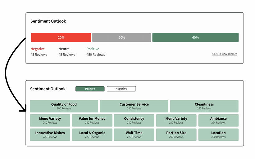
SENTIMENT OUTLOOK MODULE
_edited_edited.jpg)
Kept the ability to see both Positive and Negative sentiment but introduced them as filters to isolate each view
To make customer sentiment more actionable, I chose version 2 to surface common themes across both negative and positive sentiment. By visualizing sentiment breakdowns across categories instead of through a simple bar chart, users can quickly spot recurring issues or strengths—without needing to read each review manually. However, if they seek to read each review manually they have the option to interact with each theme independently.
Hover treatment so that once interactivity is enabled users can click into it to view all open-ended quotes that fall into theme
POP-UP
_edited.jpg)
Filtering capabilities to dive deeper into results
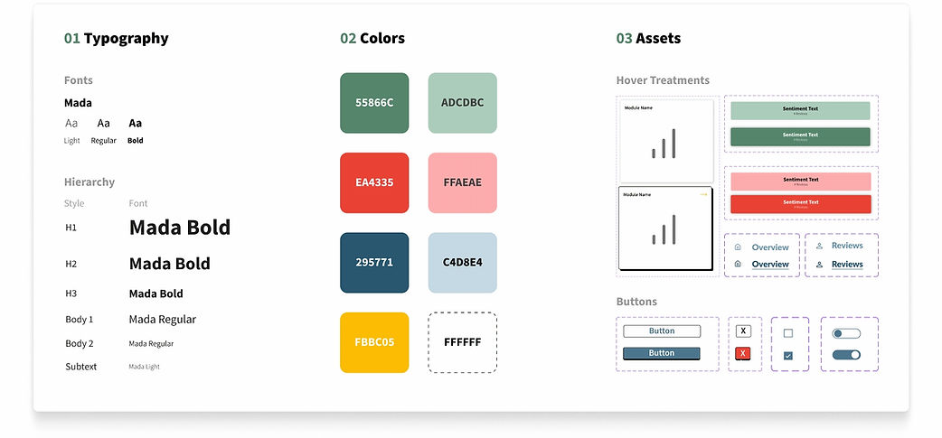
Design Kit
_edited.jpg)
FINAL DESIGN
REFLECTION
O1
O2
O3
Managing Information Overload
Designing a dashboard involves more than just displaying data—it's about making complex information digestible and actionable. The challenge I faced was managing information overload, as dashboards often present a large volume of metrics that can overwhelm users. With an RMS generating numerous summary metrics, I needed to find a way to filter and synthesize this data effectively. My solution involved prioritizing key metrics and creating clear, intuitive layouts that allowed users to easily navigate through the data, enabling them to quickly investigate and extract insights without feeling overwhelmed.
Targeting Two Pain Points
My goal for this case study was to design a product from scratch, drawing inspiration from existing review management software. However, I quickly realized that while I had many ideas for new capabilities, it was crucial to narrow my focus. I decided to center my design around addressing the user's primary pain points: dashboard intuitiveness and speed to insights. To do this, I began by reviewing user feedback to identify the core issue and ensure that my product design would directly address this pain point, leading to a more effective and targeted solution.
Future Product Development
While my current design focused on addressing the primary pain point identified through user research, I want to recognize some smaller enhancements that could be explored in future iterations. One idea is creating an AI tab, enabling users to interact with AI to draw key conclusions and guide next steps for tackling specific problems. Another idea is developing a custom module that would allow users to create and pin their own custom metrics to the overview dashboard, providing a more personalized and flexible experience.
AI MOCK-UPS
Testing AI's capabilities on mock-up production
With AI evolving so quickly, I wanted to explore how effective it could be in generating rough mock-ups for the future product ideas I outlined above, and useful it could be when integrated into UX design workflows.
O1
AI Analytics Assistant
AI Prompt
Recreate the current analytics/dashboard screen and add an AI assistant side panel on the right. The AI panel should look like a conversational chat interface where users can ask questions about the data and receive clear, concise explanations. The AI assistant should also surface ‘Solution Recommendations’ as cards or callouts based on the data shown on the screen.
*Mock-up produced using FigmaMake
_edited.jpg)
O2
Custom Module Creater
AI Prompt
Recreate this screen with a new ‘Create Custom Module’ panel. The panel should allow users to import their own data, preview the data, choose a visualization type, and save the module. The final module should be pinnable to their dashboard for quick access.
*Mock-up produced using FigmaMake
